Summary: This site creates a strong, professional impression that’s on-brand and drives sales. It’s functional, aesthetically pleasing, and has room to grow as the business' needs do.
It's easier to design from a blank slate
The site came in as a pretty basic Wordpress site. It was using the 2012 theme with a blog feed on the home page, links to social media and a bookstore in the top nav, and had an events plugin. It was pretty out of the box with almost no customization done to it. It didn’t even have a logo yet. In some ways, this is the ideal state for a site to come to me. It’s a blank slate in terms of design decisions, it’s got some articles ready to go so there won't be any holdups waiting for content, and it’s had enough time in the wild that we can take a realistic look at what it is, what it will become, and what it’s requirements are.
Never count on the promise of content
Often people come to me and say things like they need a blog, and that they'll write posts regularly, even more, they'll need some form of gallery filter because they’ll have so much content. The reality is this content never materializes. Best intentions, but it’s best to design for what we have and deal with the future if and when it happens. This site new what it was, infrequent updates and a hub for other forms of customer engagement like their Facebook and Twitter pages (both of which actually to have a high level of reader participation).
Defining the site's technical requirements
At its core, the site’s purpose is to sell books. The means of doing this is creating an engaging brand image, providing means to purchase the books, gathering leads, and alerting previous customers as to new releases.
Prioritizing sales conversions
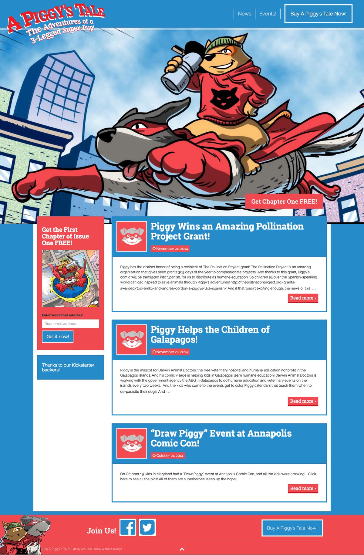
Tackling the first objective was simple. A prominent link to the store page was placed in the top right corner. When the user scrolls farther down the page and the link button is no longer in the viewport, a footer with another call-to-action button slides into view and docks on the bottom of the screen. No matter where you are on the site or the page, a clearly labeled link to the store page is on the screen. We also opted to label the button "Buy A Piggy’s Tale Now" rather than the more ambiguous and ubiquitous shop or store link.
Defining a style-guide
Piggy’s Tale isn’t your usual superhero comic. It’s the tale of a crime-fighting team-up between a three-legged dog and a cat. The site needed to match the high-level off-the-wall energy and fun of the comic while.
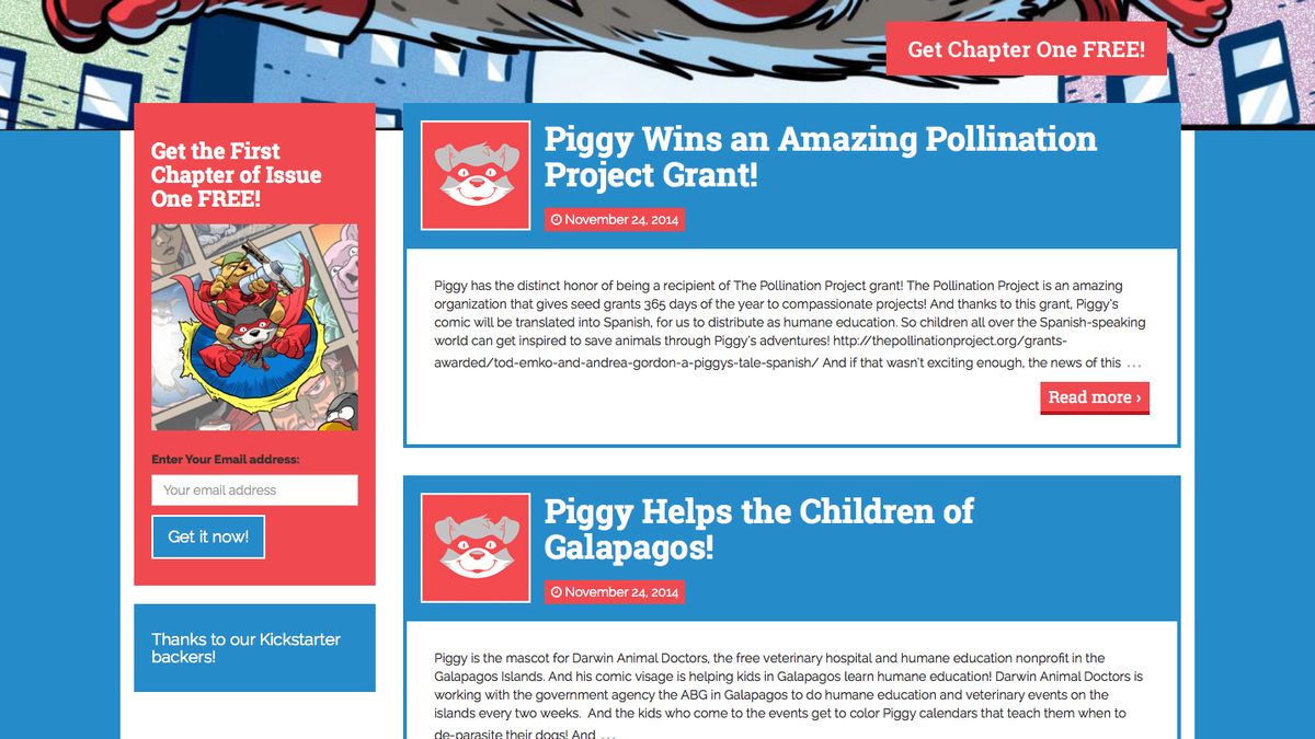
The site's color palette is built on a high contrast red, blue, white, black. I chose a red and a blue with a close value to each other which makes a pretty intense vibration when next to each other. This is why in most instances I separated them by a white border, used sparingly, the side-by-side combo adds energy to the site. Because the focus of the site is the comic we created a huge banner image across the top with a bold image directly from the comic. The whole site is designed to be bold. With large color blocks and only graphic art.
Future-proofing content decisions
Based on the images previously used on the site, I knew it would be an unrealistic expectation that future content creators would follow style guides for image selection. Given that, the post feed on the homepage was stripped down to text-only links. This ensured that once the site leaves my hands and takes on its own life, the homepage would stay strong and un-vetted photographs would be relegated to sub-pages.

How to create stronger relationships with the customer
Beyond the rich visuals, Piggy's Tale isn’t a high content site. Further, with new issues coming out on a long term timeline there weren’t going to be very frequent content updates. Combined, this creates a low incentive for returning visitors. This means that a visitor's first time on the site may be our only chance to communicate with them.
To nurture their relationship with the user, they were going to have to generate a strong mailing list and engage with their readers that way.
There are various directions a site can go to encourage subscriptions to mailing lists depending on what function the subscription provides to the user. Some sites might offer their email subscribers useful insights and tips, others might promise occasional coupons. For the Piggy's Tale user, we added value to sign up by attaching free content. By offering the first chapter free for the price of the reader’s email, we’re providing a try before you buy service to the user, as well as offering complementary value and building goodwill.
A simple site with room to grow
This site is a great example of delivering bang for the buck. It creates a strong, professional impression that’s on-brand and drives sales. It’s functional, aesthetically pleasing, and has room to grow as the business' needs do.

