Summary: ..every piece that makes it into my portfolio is one I’ve struggled with. That’s not to say I struggle with every piece, but if things go too easily, it means you’re phoning it in and the piece isn't getting that little something extra.
Switching over to a completely digital illustration workflow from my prior traditional medium background has not only sped up my work process, but it has also facilitated final round revisions and enabled much more detailed and comprehensive documentation of the process than I was able to capture before. I thought I might use this last aspect of digital painting to create a detailed work through a typical project, from brief to final.
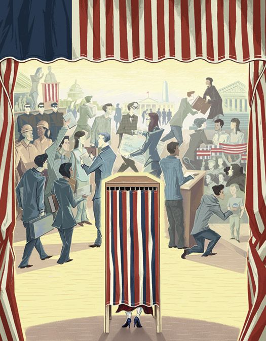
Though I'm sharing a step by step process of what goes into a finished piece, I don't think this will function as a traditional technique "tutorial" per se, but rather as an illustration process tutorial, or walk-through, as largely what I'm going to focus on is the thought process behind the decision making which goes into a final illustration. There's no magic make-it-awesome Photoshop button, nor are there imitable tricks involved outside of good-old-fashioned drawing and painting techniques. In regards to the skill level of this guide, it applies to anyone though it assumes a strong working knowledge of the digital tools involved.
The tools I used for this were an iMac, a Wacom Intuos3 tablet, Corel Painter, and Adobe Photoshop, though the same process might just as easily be translated over to other software such as Art Rage or Gimp, or even to paper, pencil, paintbrushes, and paint.
Step 1. The Call
I was thrilled when I got the call from Ithaca College to do the cover of their alumni publication, ICview, not only because they do a great job, but because in this global internetwork arena it's always a joy to get a local work call. After a brief conference over timelines, usage rights, and rates, it was on to step two.
Step 2. The Brief
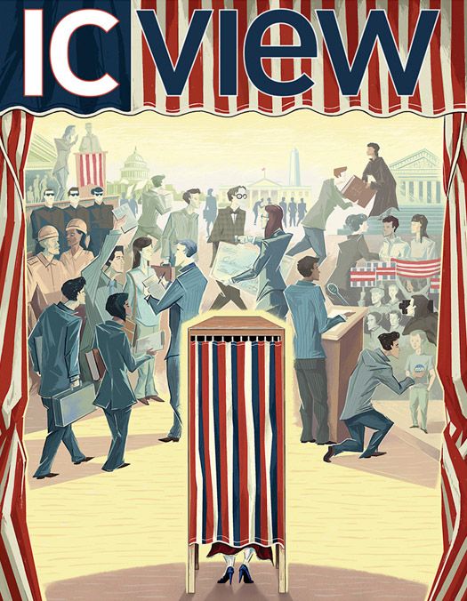
The feature story for this issue was to be "Behind the scenes in politics", a look at Alumni who were working in various levels of government. In particular, it was important that the illustration NOT become a satirical or a partisan piece. The magazine editors already had a conceptual direction when they turned to me; they wanted an illustration showing the divide between the hustle and bustle of the political arena and the solitary dimension of the voting experience.
Step 3. Concept Thumbnailing
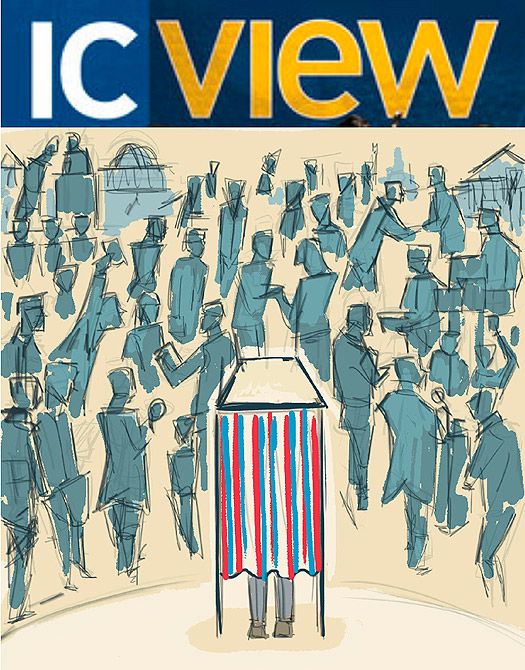
Since I already had the principle concept given to me for this project, my task was to come up with the best compositional and stylistic solution to the problem. The thumbnailing phase of the project involves coming up with as many different solutions as possible with what is essentially 2 scribbles, likely indecipherable to anyone but myself. Any given project might involve 25 to 50 thumbnails, many of which will be variants of each other. At this point, the most promising solutions take shape, and I subsequently "clean up" the best two or three of these, which will be advanced to the next stage.
To give you an example of how loose thumbnails are, here are the two which would generate the final piece (including their "cleaned up" versions).
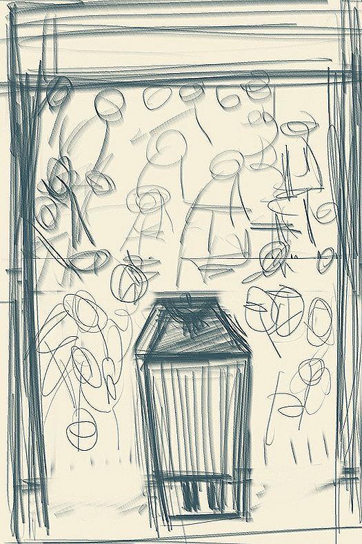
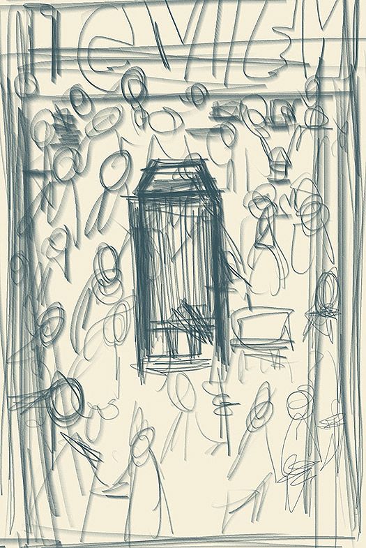
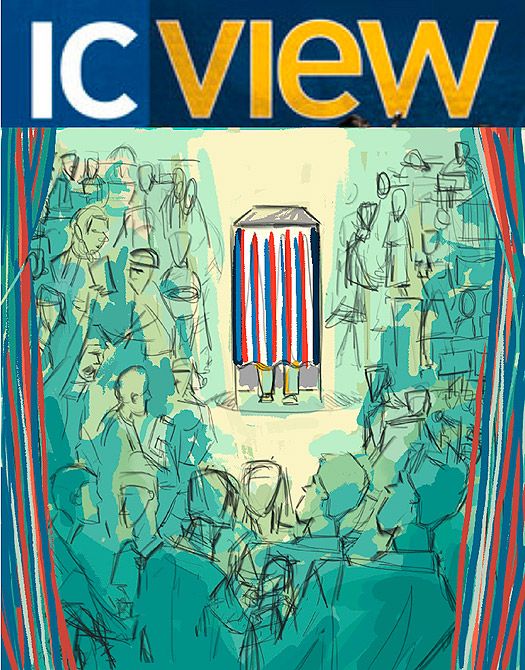
Submitting anything at this stage of development would probably be enough to send any Art Director running to their Rolodex in a desperate search for a backup illustrator. So, before being sent off, the thumbnails get another cleanup – up to a level at which they are clear enough for the AD to make an informed decision and give feedback towards the final. For this project I sent along two relatively tight color roughs which I felt strongly conveyed the concept, but with two different compositional and atmospheric solutions.
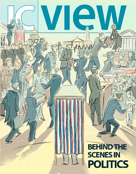
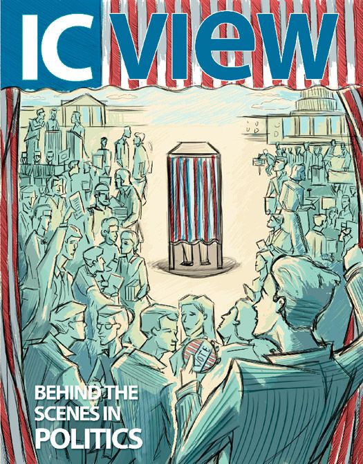
Step 4. Cleanup
There is an unwritten rule in an illustration which is that if you send along multiple concepts the client is will always go with the one you like the least. I had gone through a streak of this with several of my last assignments, so that, although I produced some perfectly good illustrations, there was also an unfortunate pile of (what I thought were) great ideas on the cutting room floor (perhaps fodder for some great stock work down the road). I am really happy to report that the rule was broken this time! They went with the piece that I was most looking forward to painting, the one with lots of open room for stylization, the one I thought would make a better final, the one I was sure they weren’t going to pick; one small revision, bring in the curtains from the other piece.
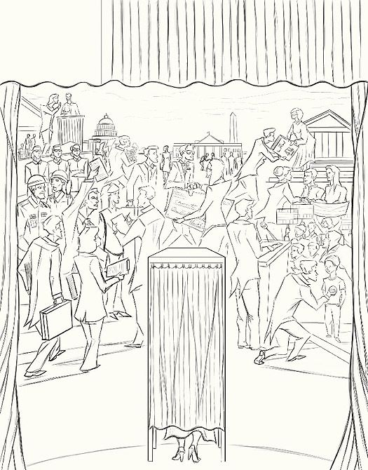
I start with a quick mashup of the two drawings in Photoshop – now, this kind of change requires a full redraw to make everything work together properly. Before I move on to color, I always do a very tight linear. I like to work out all compositional issues and include all the details at this point because it’s been my experience that, if it's not fully resolved at this stage, it will never be so satisfactorily. Another unwritten rule in illustration is that if you leave an area unplanned, thinking you'll figure it out while you're painting it, it will forever be the weakest part of the illustration.
Now, because this was a cover and not an inside piece, this job was subject to a second round of rough revisions. This didn’t change the degree of ‘tightness’ to this final linear, however. In the past, Art Directors have worked on their layouts using my linears, knowing that the final artwork would line up with almost no variation.
Step 5. Underpainting
The second round linear having been approved, it was on to the painting.
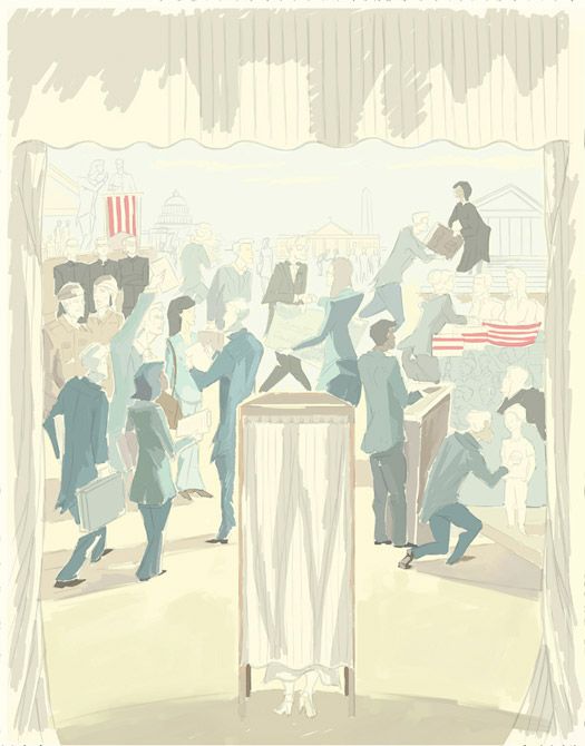
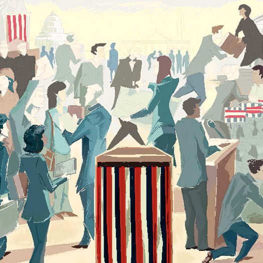
I come from a traditional painting background. I treat digital painting as though it were a canvas. I begin with a wash across the entire surface, in a color that sets the tone for the piece. With this piece, I chose yellow to keep things looking positive, fresh, and exciting. From here, I do some more washes to block in value areas and define forms.
Next, I switch to more opaque paint and begin blocking in color. There’s no real detail at this stage, it’s just figuring out which colors are going to go where and then adjusting them to get a proper push/pull to the to establish perspective to the elements (darker darks, lighter lights, and more contrast upfront and less saturated, more even value tones in the distance).
On a technical note, this is all being done in Corel Painter (including the initial thumbnails and linear roughs). On this piece, I used a Broad cover watercolor brush for the wash stage and then switched back and forth between an acrylic dry brush and a broad cover gouache brush to block in colors.
Eventually, once there’s paint covering everything, I can really begin to think about the piece.
Step 6. Refining
Up to this point, I have been working on layers underneath the drawing with the drawing layer set to multiply and its opacity turned down really low. Now, I begin to work on layers on top of the drawing, eventually completely covering all the linework.
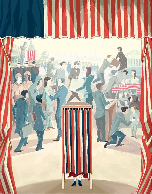
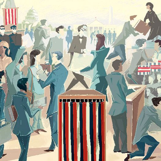
From here until I finish, I will work on little bits and details all around the painting. I might work on someone’s jacket for a bit, then jump over to someone else's head on the other side of the image. There’s no real rationale as to what part gets worked on next, other than my turning to the area which I feel needs more refinement to keep things balanced and maintain my understanding of where the piece is going.
In case this is not perfectly clear, I will explain it in another way. Even though I start with a very tight drawing, and at this point I am essentially just coloring it in, it never becomes a ‘paint-by-numbers’ routine. I am always trying to maintain a balance and a visual rhythm within the piece. Many areas get repainted several times, colors being adjusted so that they work with the piece as it evolves. It is for this reason that the two most important things I do here are: (1) I don’t get too detailed too soon. I build the detail up all around the piece, that way I don’t become too attached to anything to be unwilling to paint it out. (2) Lots of layers. There just aren’t enough undos in my history to go back to where I’d like to revert sometimes. I try stuff out, I experiment, I make mistakes. But, I always do it on a new layer. I do periodically flatten things down once I’m sure of a decision, otherwise, the file size can get out of hand.
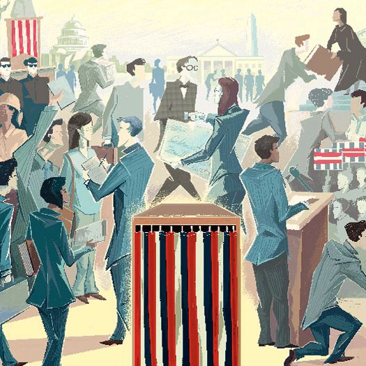
Step 7. More Refining
I've broken the refinement process here into two steps, just to emphasize how much work goes into the details. There's an old saying that ninety percent of the work goes into the final ten percent and this is true of every piece I've worked on. I continue to work around the piece, making minor adjustments and refining details until I feel the piece works as a whole. Starting-out illustrators, I feel, often walk away from a piece while it's only ninety percent done, not understanding that to a large degree, the only thing keeping it from being a stand-out piece is some additional time. Perhaps the old master illustrators can get things right on their first attempt, but for me, every piece that makes it into my portfolio is one I’ve struggled with. That’s not to say I struggle with every piece, but if things go too easily, it means you’re phoning it in and the piece isn't getting that little something extra.
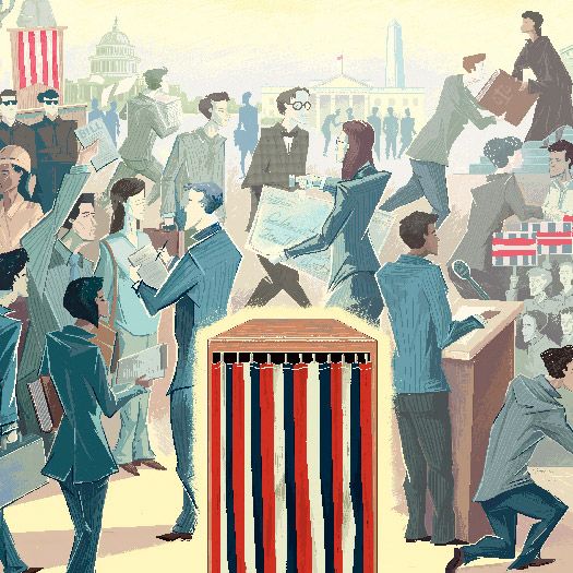
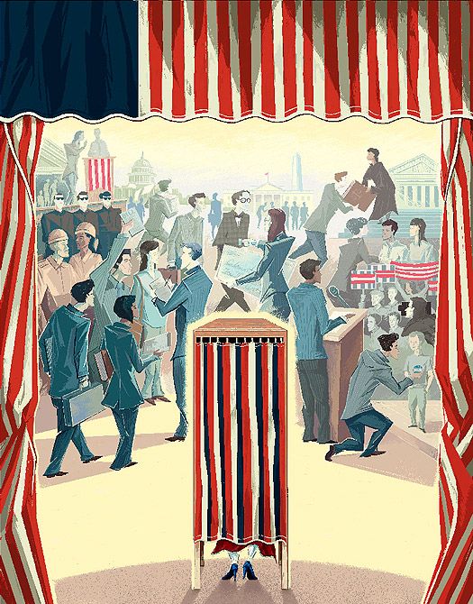
Step 8. Final Color Adjustments
This last stage is where Adobe Photoshop finally makes a significant appearance in the process, and this is the closest thing to pressing the magic make-it-awesome button there is. I'm sure this could also be done using Painter's adjustment tools, but Photoshop's color correction abilities are where its strengths shine.
To bring the illustration into Photoshop, I simply export it from Painter as a flattened TIF file and open that up in Photoshop. In the layers pallet, I create a new adjustment layer and use the masking property to localize its effect. In this piece, the principle color adjustments were achieved by creating a mask applied to the curtains and then selecting and inverting it to create one which applied to the crowd. This way, to create the proper level of depth to the piece, I could adjust the colors of the two independently.
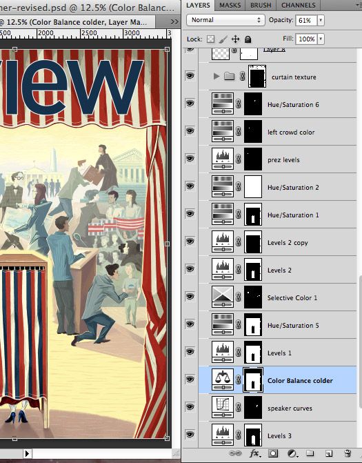
As you can see, at this point I principally work with Levels and Curves to achieve a higher contrast (tip: switch the adjustment layer's blend mode to luminosity so that it doesn't affect saturation), Hue/Saturation to slightly mute some colors, and selective color to adjust the overall tone of the piece. If you look at the layers pallet here, you'll also see that there were a couple very localized adjustments such as adjusting the president so that he stood out just enough to read, yet still fell into the background, as well as a bit of scanned texture added to the curtains to make them pull forward. The masthead is a placed Adobe illustrator file.
Step 9. Sign, Seal, Deliver
And that's it. I squeezed in a small signature in Photoshop, flattened everything, zipped it up, and ftp'ed it away.
Wrap-up
It was a pleasure working with the entire Ithaca College marketing department on this project. Bringing the final art together really was a team effort. The art director, Kristine Miller, was great in pushing this illustration to be all that it could be, and the designers did a fantastic job laying in the type. And I have to say, they did an extra AMAZING job transforming the piece into an animatic for the e-book version. If you have an iPad (or some other form of non-apple tablet), I highly recommend downloading the e-publication.
