Overview
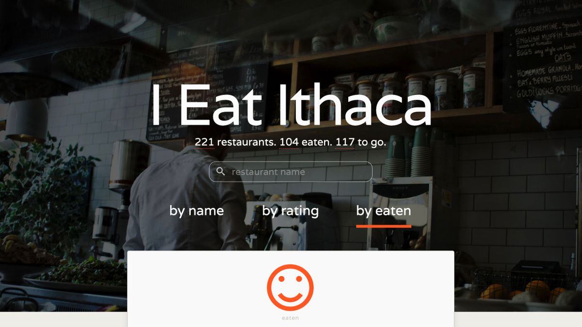
I Eat Ithaca is a public to do list of all the restaurants in Ithaca, NY. The site displays a list of all the restaurants in Ithaca. Each restaurant entry indicates if I've eaten at it or not, and if I have, includes a review. At the top of the site, a running total displays my progress towards eating at every restaurant in Ithaca. Users can sort the restaurant list alphabetically, by rating, or by whether or not I've eaten at it.
The site can be viewed at ieatithaca.com.
Problem this project solves
I Eat Ithaca was a personal project created with two goals:
- Learn new code. At the time of building this, Angular.js and CSS Flexbox were both relatively new. In my day job, I work on an enterprise website that needs to support legacy browsers. Personal projects are a great way to learn new skills. I have always found that diving headfirst into a project is the best way to learn something new.
- Try new things. We all get stuck in routines. As arbitrary as the goal of eating at every restaurant in town sounds, it forces one's self to try new things–a baby step towards a life of curiosity, exploration, and adventure.
At the end of the day, the target audience for this website is me. If along the way, it helps someone else discover a new restaurant, or if it raises awareness of the culinary diversity in Ithaca, that's great. But that's probably as unlikely to happen as it is that somebody is reading this.
UX decisions
The website's content is divided into two main content sections: The Banner, and the Restaurant review cards.
The banner clearly defines content expectations for the user

The full-height banner at the top of the page gives users all the information they need about the website–It defines the site's purpose and indicates the next steps the user can take. Above the fold is often used to justify cramming too much information at the top of the page, but when used properly, it is a valuable concept. The area above the fold should be clear, remain free of extraneous information, and tell visitors what the site is about.
Aided by storytelling-animation, first-time visitors to I Eat Ithaca get a complete picture of the site. They know it is about tracking progress towards the goal of eating at all the restaurants in Ithaca. And they know that it is searchable by three modalities.
The progress numbers are the most engaging aspect of the site and so are displayed prominently. For users only interested in this information, the banner serves as a status dashboard.
Make dense information digestible
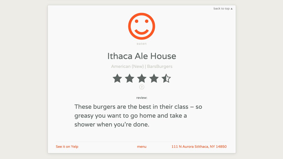
The main body of the site provides a list of all the restaurants in Ithaca. Depending on the availability of information, each restaurant displays a rating, a review, a label indicating if it has been eaten at or not, and links to external review sites and google maps.

Lighten the cognitive load
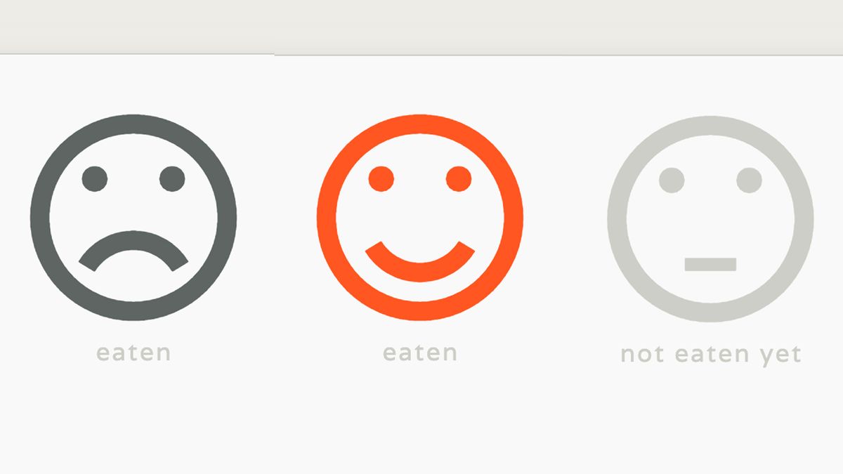
Providing a quick visual indicator of whether a review is positive or negative makes processing the information easier for the user. Star ratings are ubiquitous and well understood, but the user still needs to repeatedly interpret what a particular rating means, what their threshold of acceptability is.
Each review is labeled with a happy or sad face to reduce the cognitive burden on the user.

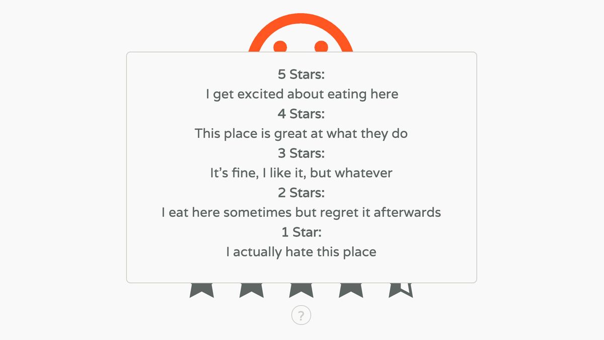
Provide context to the data
Hovering over the info icon brings up a rating guide for those who want to dive deeper into what the rating system means,

Development–build process & decisions
Technology stack
- Html5Boilerplate
- sass
- Angular.js
- ngAnmiate.js
- Tabletop.js
- gulp
- googleapis
I Eat Ithaca is built on top of Html5Boilerplate. The CSS is written in SASS and compiled using Gulp. Angular manipulates the data and the DOM. The animations are facilitated by adding the ngAnimate module.
All the restaurant data is stored in a published Google Sheet and fetched as JSON using tabletop.js.
Data acquisition
Restaurant data was acquired from Yelp using a great web scraping tool, Web Robots Scraper
App build
The app is pretty simple–It's just a loop through each of the restaurant entries, conditionally including elements and classes based on the existence of a few fields: Has the restaurant been eaten at or not? If it has, did I like it? Have I reviewed the restaurant? If I have, show my review, if not, show the Yelp review. Finally, does the entry have external links? If yes, insert the link URLs, otherwise, insert placeholder text.
Early in the development process, I realized that updating content would soon become a pain-point for me. I typically work across multiple workstations. Storing the data in the repo would necessitate each computer always being synced. Further, this project was built without continuous deployment so changes would need to be FTP'ed to the server. Lastly, not separating the data and the app would mean no method to update the site using my phone, which as a review site would be the most convenient.
It occurred to me that there ought to be a method in place for using google docs as the data source, and of course, after a quick google search, it turned out there was.
Tabletop.js is a module that allows you to use spreadsheets as an angular data source. Times.tabletop.js further extends this to use the google sheets API.
CSS build
A primary consideration in building the CSS or this site was that the payload remained light. There aren't many components in this app and so no need to load a full framework. My criticism of using bootstrap or the like for most projects is that most of the framework's components will not be used in the app. Frameworks are great for prototypes, but less so for production builds.
I Eat Ithaca is built using Bourbon. Making use of imported Bourbon mixins is great because Bourbon doesn't output any CSS of its own and so doesn't increase the final file size. I also used Geoff Graham's SASS port of animate.css. Geoff has rewritten animate to make it completely modular, so I could import just the fade-in and out animations I used.
Successes, failures, and future features
Overall, I feel the design and the user-experience are quite successful.
- The information architecture is intuitive and the content readable
- Content is discoverable and searchable
- The interface is intuitive and usable
- The design is harmonious, responsive, and cross-browser tested
The user experience could be made better by adding cuisine types to the filter tool. The Cuisines string would have to turn into tags. Then the input filter would have to autocomplete based on the existing tag values and filter the list by that input. This seems like a natural extension of how people choose a restaurant. Perhaps I'll look into adding this to a future release.
Finally, one unexpected discovery through this project was the rate at which restaurants in Ithaca turn over. If I were starting this project again, I would change the data structure. Rather than merging my data with the scraped data, I would keep the two sources separate and merge them either client-side or in a build process. This would make updating the master list of all the restaurants in Ithaca easier. Rather than integrating new and changed entries manually, it could be as simple as performing a new scrape.
