CSS Flip Book Animations Using a Simple SASS Mixin
A re-useable Sass mixin to create CSS animated sprite sheets at different frame ratesSummary: Use a simple, configurable, SASS mixin to bulk-output multiple sprites at different durations and resolutions. CSS can create a classical, or flipbook, style animation from a sprite sheet for improved performance and accessibility.
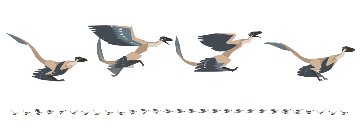
Below is an example of an SVG sprite sheet and a Codepen to see it animated using the SASS Mixin. full code is at the bottom of the post
Animation basics
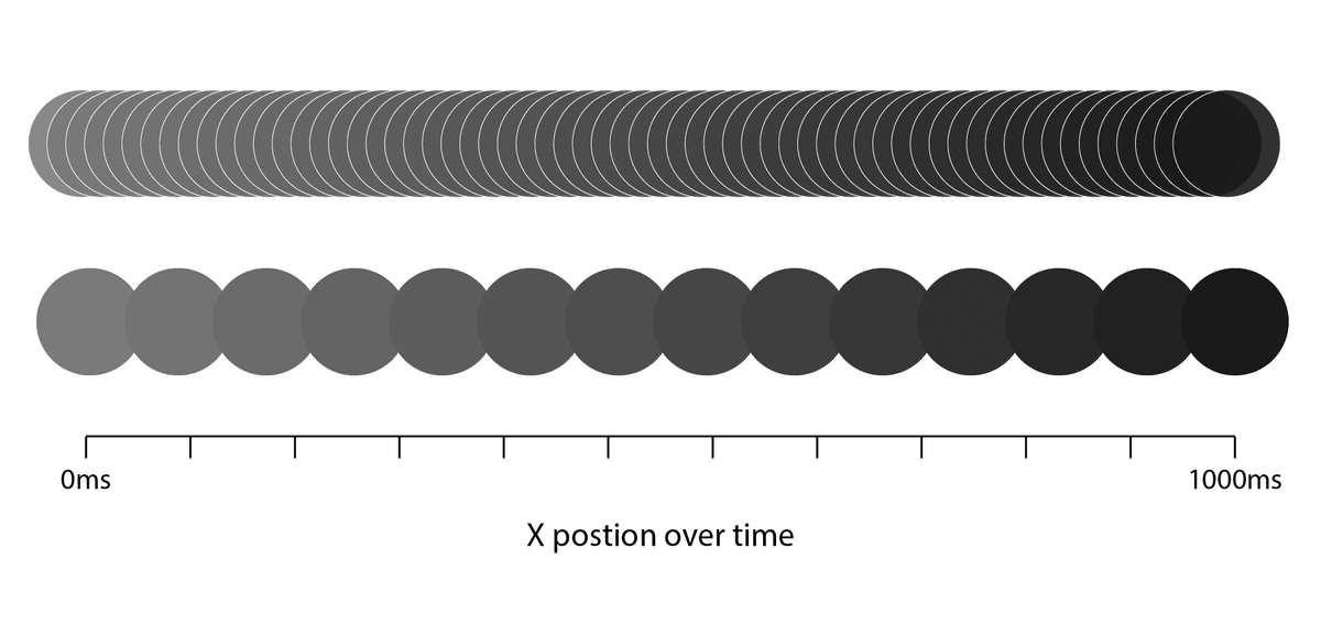
Inbetweening, or tweening, is the process of creating the in-between steps of an image that transform it from one state (keyframe) to another. Most of the time, when we see an animated design element on a webpage, the animation is created by a process whereby two or more keyframes are defined, and the computer generates the transition between those states. This process is true from simple animations, like creating fade-ins by transitioning from a zero opacity state to a one hundred percent opacity state, to complex animations with thousands of nodes moved in three-dimensional space.
Frames per second (FPS)
We think of computer animation as being a fluid movement between point A and point B. In reality, the computer calculates graphical state along a transition timeline, rendering it to the viewer as separate static images at a rate of 60 images per second. Because this is too fast for our brains to perceive the individual images, we interpret them as a single fluid transition. How many frames-per-second are needed for this optical illusion to take place? Surprisingly few. The human visual system can process between 10 and 12 images per second while still perceiving each image individually. Beyond twelve images per second and we perceive them as motion.

Traditional animation (back in the days of film)
Through most of animation history, creating the in-between images between keyframes was done manually. Animators would redraw the same image with incremental changes by hand to create a transition from state A to state B. This process being hugely time-intensive, animators wanted to redraw the fewest frames possible while still creating the illusion of movement, which, as already established, is 12 frames per second (fps).
Back then, the only way to see animations was to show them using film projectors. Film projectors, however, ran at a rate of 24 fps. Animations created at 12 fps would end up running at double speed. To show animations on film projectors, which are twice the frame rate required to simulate motion, each animation still was photographed twice—an identical image would be held for two consecutive frames—effectively doubling the frame rate without increasing the work involved to create it.
This doubling worked for standard movements, but in cases where fast movements were animated, a higher frame rate was required to create the appearance of smooth motion. Slower movements were then shot with doubled frames (twos), while fast movements were shot in single frames (ones), allowing everything to add up to the 24 frames per second on the film reel.
Early animation via sprite sheets

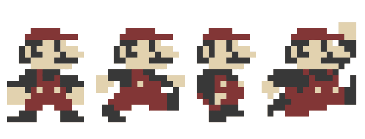
Early video games never felt animated, but they still conveyed motion in a way that was able to run on the low-graphic-capability machines of the time. They represented motion via sprite sheets. Sprite sheets are a single image file with a graphic element in various poses. Essentially, all the point A and point B keyframes of an animation, without the intermediate frames, in a single image. The games would selectively show cropped portions of the image as the game state changed. Although the frame rate fell far short of one required for the illusion of movement, our brains were eager to ignore the gap.
Sprite sheets continue to be used today, but because of huge increases in computer memory, they can be much larger and hold many more intermediate states—enough intermediate states that they can effectively convey animation.

Create an animated sprite with CSS
Even with modern graphics cards and tweening capabilities, it is still prudent to animate using a series of static images sometimes. Sprite sheets are still commonly used in games, and if you are going to be looping through a short sequence that involves many changing parts, the tradeoff in load time may be worth the performance gain in any web application.
Though an animated gif creates essentially the same effect (a low frame rate animation from a series of stills), creating a looping animation with a sprite sheet and CSS has the advantage that you can toggle play/pause states as easily as adding and removing a class. The ability to start and stop animations can have practical applications in story-telling, interfaces, and accessibility requirements.
Sprite sheet mixin
I recently worked on a project that required making several animated graphics with sprite sheets in CSS. To simplify the process, I created a simple, reusable mixin that could easily handle animations of different dimensions and durations.
Tip: Sprite sheets can get pretty large—to keep the file size down, I used SVGs.
Explaining the code
Changing just a few variables at the bottom generates two unique classes, one with a static image from the first frame of your sprite sheet and another with a looping animation.
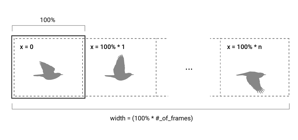
The math involved is pretty simple and involves the following concepts:
- Calculate the frame width by dividing the width of the sprite sheet by the number of frames.
- Set the aspect ratio of the containing div by padding the bottom by the height divided by the frame width.
- Set the background image of the containing div to be the sprite.
- Make the background image size equal to the number of frames, multiplied by the div width, so that each frame is the full div width.
- Break the animation into the number of steps for which there are frames.
- Move the background to the left by an additional 100% of the containing div's width (one frame) at each step.

SCSS mixin
.bg-sprite {
	width: 100%;
	height: 0;
	animation-timing-function: step-start;
	animation-iteration-count: infinite;
	background-repeat: repeat-x;
}

@mixin bg-sprite($name, $sprite-height, $sprite-width, $sprite-cell_count, $animation_duration, $sprite-url) {
	.bg-sprite--#{$name} {
		padding-bottom: percentage($sprite-height / ($sprite-width/$sprite-cell_count));
		background-image: url( #{$sprite-url} );
		background-size: $sprite-cell_count * 100%;
		transition: transform $animation_duration;
		background-position: 0% 50%;
	}
	.bg-sprite--#{$name}--playing {
		animation-name: animatedSprite-#{$name};
		animation-duration: $animation_duration;
	}
	@keyframes animatedSprite-#{$name} {
		@for $i from 0 through $sprite-cell_count {
			#{$i * (100% / $sprite-cell_count)} {
				background-position: (-100% * $i) 50%;
			}
		}
	}
}

$sprite-height: 220;
$sprite-width: 2048;
$sprite-cell_count: 9;
$animation_duration: 1s;

@include bg-sprite(
	'robin',
	$sprite-height,
	$sprite-width,
	$sprite-cell_count,
	$animation_duration,
	'./sample_sprite--${name}.svg'
);
Efficiency through reusability
Do you need to make multiple sprite sheets? For ease of reusability, I created a Sass function that can bulk-generate multiple animations, each tied to their class name.
$avatar_list:
	(tawa, 6, 500ms)
	(microraptor, 29, 1100ms)
	(robin, 9, 500ms)
	(future, 10, 400ms);

@each $name, $animationsteps, $speed, $url in $avatar_list {
	@include bg-sprite(
		$name,
		$sprite-height,
		$sprite-width,
		$sprite-cell_count,
		'./sample_sprite--${name}.svg'
	);
}
